Native Design Process for Telegram Mini App: Magfi Center & Marketplace
June 23, 2025
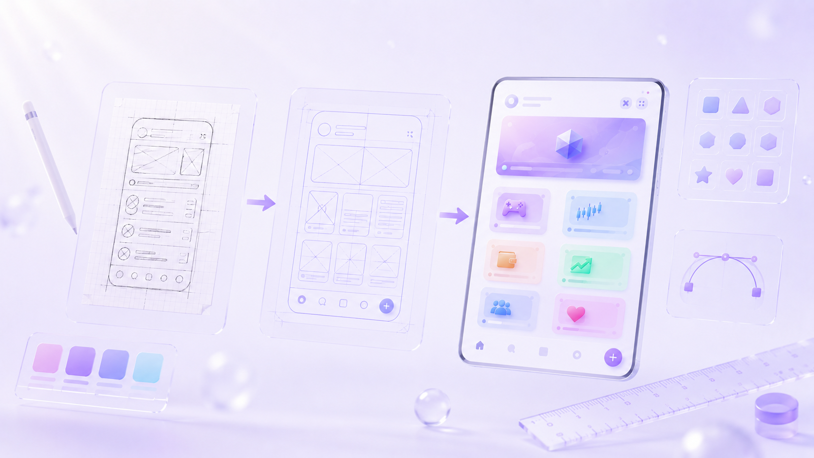
Telegram Mini App technology offers brands and developers entirely new ways to interact with users directly and quickly. At Magfi, to make the most of this potential, we designed two experiences — Magfi Center and Magfi Marketplace — using a fully native design approach.
In this article, we'll walk you through, step by step, why we chose "native design," the technical details, and our design decisions.
Why Native Design?
Although a Telegram Mini App inherently feels web-based, it's crucial for the user experience to preserve the platform's native look and feel. With that in mind, our primary goals were:
- Respecting existing user habits
- Staying true to Telegram's own UI/UX language
- Integrating seamlessly with the platform's native color, typography, and interaction systems
With this approach, we transformed the Magfi ecosystem into an app-like experience directly inside Telegram.
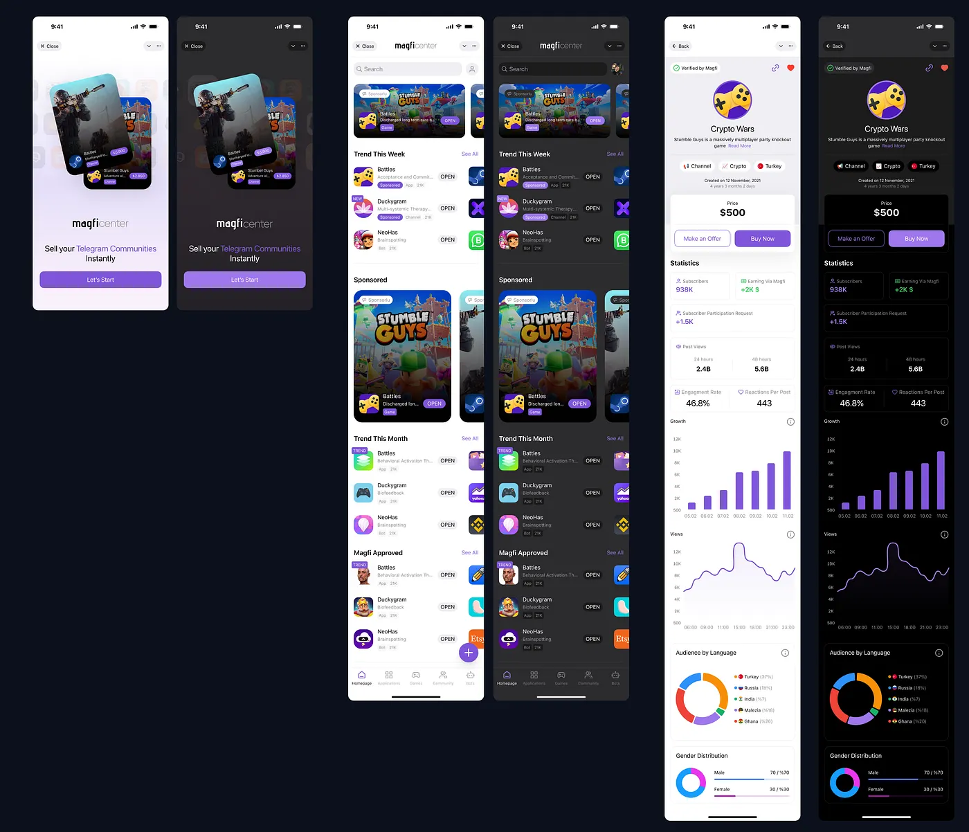
The Native Color System We Used
During the design process, we based our color variables on Telegram's own semantic color token system. This ensured full support for both light and dark themes.
Below, you'll find the core color variables we adopted:

Typography: Fonts, Hierarchy & Readability
Telegram uses "Roboto" on Android and "SF Pro" on iOS. Accordingly:
- We defined platform-specific font families.
- We established a clear typographic scale for headings, body text, and action buttons to create a simple yet strong visual hierarchy.
- We optimized line height and letter spacing to improve readability in long-form content.
UI Elements & Component System
All components were built to be:
- Fully compatible with the UI elements permitted by the Telegram Mini App SDK
- Responsive (adapting to different screen sizes)
- Reusable (component-based)
- Theme-aware (supporting both light & dark modes)
Some of the components we implemented:
- Primary / Secondary Button
- Section Card Component
- Header Component
- Empty State & Loader Component
Conclusion: Being "Native" on Telegram
The Magfi Center and Marketplace projects made one thing clear: when developing a Telegram Mini App, not only the code but also the design language must be native in order to create an experience that feels like it truly belongs to the platform.
By utilizing native colors, native fonts, and native interaction models, we built a user interface that feels right at home on Telegram. This experience both boosts user satisfaction and reinforces the platform's sense of trust.